iPhone & iPod Touch’s instant access button (you can allocate functions)

I’ve found it quite hard to quickly turn up and down the volume of my iPod Touch when I want to on a crowded train. There is lot of noise when the train is running, so I turn up the volume, but when it stops, it becomes quiet around so I have to quickly turn it down. When I was using my old iPod shuffle, it was quite easy to manipulate the basic functions even when I wasn’t looking at it. So naturally I want that usability for my iPod Touch.

You know there’s a button on top of iPhone and iPod Touch to lock/unlock the screen. I think that can be used for a few useful purposes. As iPhone and iPod Touch know which side is now up and which side is down, it should also know “when the button is pushed with this side up”. So there can be a few functions you can customize like:

If the button is clicked when…
1) the top side up — lock/unlock the screen
2) the bottom side up — mute/regain volume

And if the button is clicked TWICE when…
3) the top side up — access the homepage with Safari
4) the bottom side up — YouTube launches

Something like that.
What do you think?

Examples of the button usage
iPhone & iPod Touch’s instant access button

Send a Christmas card using Youtube!

Youtube Xmas Card

I made a Christmas animation and uploaded it for Youtube.
Check it out and if you like it, you can download an e-mail template linked to the movie.
It’s for Apple Mail (Leopard). The e-mail card and the animation make one story.

How to use the template is pretty simple: just double-click it and you’re ready to type in!

It’s free because it’s a Christmas present for you all.
Have fun!

download e-mail template

[youtube=http://www.youtube.com/watch?v=4TmfZqC6etI&rel=1]

Customizing your drink in website before going to Starbucks

Customizing your drink in website before going to Starbucks

How about having a website where you can customize your cup of Starbucks coffee as you like (hopefully intuitively with lots of visual aids) on your PC, mobile or PDA and SEND it to your favorite Starbucks store? You just go to the store and tell your number given in the website, and the clerk says “OK, you pre-ordered ‘Grande Add shot Caramel Light Whip Caramel Sauce Mocha Sauce White Chocolate Mocha Frappuccino’, right?” instead of your saying it. In the website, you see other customers’ choices, suggestions, tips for your choice, rankings, etc. Some of those are already realized in the Japanese Starbucks website, but I believe they can add some Amazon-like features to it. It’s wiin-win-win situation for you, Starbucks and other customers.

Future of Internet Search

future search engine

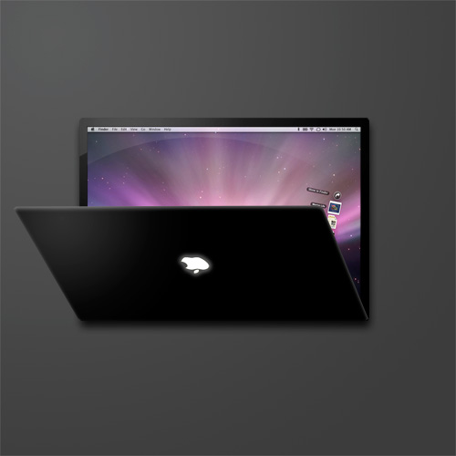
This idea is mostly based on what I thought for a search engine portal’s design competition (not Google’s) held a few months ago in Japan, where mine was picked for the first round. I redesigned it a little bit after that (especially after getting amazed by the latest touch screen technology). By looking at the future user interface by Apple’s iPhone, Microsoft’s Surface, Multitouch and so on, it is quite obvious to predict what the future user interface will be like. These are good examples of making the user experiences “intuitive”. I won’t elaborate on it, but “being intuitive” is essential when it comes to developing a user-friendly website. Not only website but whole other stuff which requires a user’s control.

“Search” is to look for and find something. When we look for something, we usually picture the object’s color, shape, size, etc. first in our heads. Then you think of the place you saw the object last, go and look around there to find something similar to what is pictured. You use your nose to smell and hands to feel and get unwanted objects away. In this design, the search results, websites, contents, images and banners are all “objects”, which are identified as icons. You look for something just like you do in the physical world. It has a table like plate in the middle and there are icons on it. Through the real-world physical movements, intuitive controls of “search” is realized. In addition, an unreal but ultra-practical action is incorporated by taking advantage of technology.

In short, this search can do:
Put and remove stuff by drag & drop
Organize icons to categorize scattered icons
Quick preview just like you take and see stuff closely
Set stuff you need aside for laterPile up icons, etc.

homepage

Home page
This is what you see first when you log in. It’s as simple as Google top page.
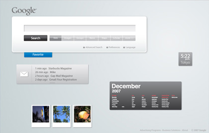
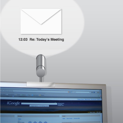
personalized home

Portal Home
For the personal portal site like iGoogle, you see ad banners and customized contents, tools, etc., but all of them are shown as icons. You can touch, move, pile and throw them just like books and paper. Your favorite items (clock, memo pad, calendar, RSS reader, weather news, etc.) can be added as you like. Simple mail app allows you to read and write mail quickly. The customized tabs on the left show the category you pick up, such as news, music, movies. By clicking one, the related icons rush into the screen.

searching animation

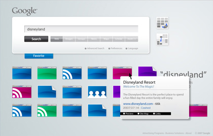
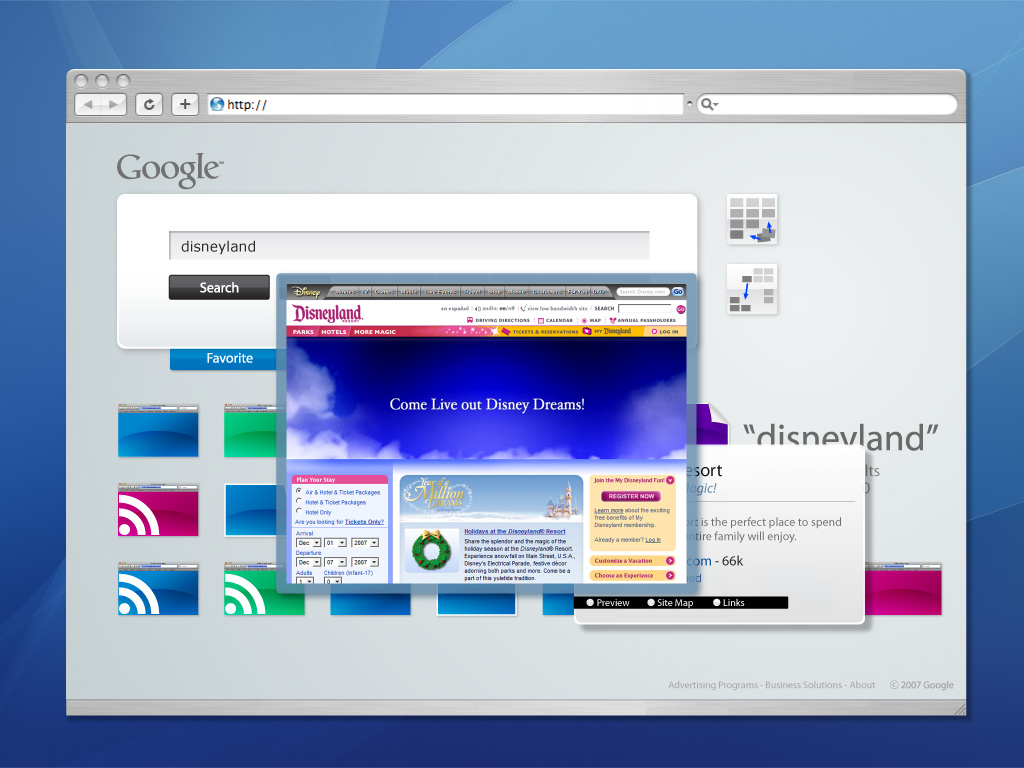
Search screen (Each icon is supposed to show the website’s image actually. Lazy me!)
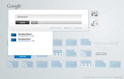
Input the keyword and hit “Search”button, search results roll in the window until there are a certain number you first set. The keywords you used are displayed clearly in the screen. In most cases, a screen with lots of objects in it look busy and not aesthetically pleasing, but here I tried to make the search results themselves become a part of design. Each result icon is shaped according to what it is categorized: website, image, RSS, groups, ad banners, etc. The more the website is optimized for SEO, the more chance it has to appear upper and left side of the screen, thus stands out. If the number of the results hit the limit, the next group will be put in the area below the first one. You can see them by clicking the arrow, of course, but in the transition, the “camera” moves downwards.

search results aligned

Search Results Aligned
After the results roll in the screen, the “Align/Categorize” buttons appear in the top right side. “Grid/Scatter”, “Category”. The Grid button makes all the icons align straight on the grid, while the Scatter button mess them up. When you click the Categorize button, icons of the same category flock together.

When the cursor is over an icon, the meta data is shown graphically, which allows you to predict the contents of the site quickly before actually visiting.

quick look at website

site map preview

You can also click the “Site Map” button to easily get the visual structure of the website. Also, “Links” button gives you the sites linked to it.

favorite box

Favorite Button By clicking the “Favorite” button (or dragging an icon towards the button), it opens and becomes ready to store icons. Here you can stock results you like for later review. Drop an icon there and it is automatically aligned and its simple introduction is shown. When there are multiple icons in it, they are categorized automatically.

favorite box functions

I want to use a search like this, but I’m afraid the hardware won’t come up with the data processing… We have to wait for a while.

Ultra thin display

sheet searching words
Accustomed to Google search so much, I sometimes look for “a search button” even when I read a real newspaper looking for a specific word. So it would be nice if there is a device like this to quickly find and highlight the word you specify. It would be even better if it can tell you the meaning of a word you don’t know. It’s so light and thin that you wouldn’t mind carrying it around at all. Oh, if there is a keyboard that can attach the screen to it, it’d be really good if it works as a computer.

translucent display
Pubic billboards and spaces are so much filled with information that it takes you time to find what you really want. With this transparent sheet, only you can see the info you want on various places like walls, floors, ceilings, notice boards, etc. In a large building with many people coming for the first time, such as hospitals, this sheet could be handed to a visitor (especially a senior) as a guide. This way, what you see and how you see it can be customized.


Creative Commons License


This work is licensed under a
Creative Commons Attribution 3.0 Unported License.

Simple Projector

simple_projector
If you’re away from your computer and it tells you that you’ve got mail (visually), isn’t it useful? A simple USB connected projector reflects simple info against the wall, ceiling or desk. If your desktop is filled with lots of windows, it might be helpful if a “Meeting starts in 5 min!” message suddenly appears on the wall. Or if you’re concentrating on something so much you don’t want anyone to talk to you, you can say “Do NOT Disturb” without having to actually say anything.


Creative Commons License


This work is licensed under a
Creative Commons Attribution 3.0 Unported License.

My Dream Mac (Macbook Touch? Mac Nano?)

Please check out the latest post “My Dream Mac #2 (Macbook Touch Concept)“.

My Dream Mac #2 (Macbook Touch Concept)

(I updated my dream mac in a later post. See this one, too.)

macbook_touch5

Now that iPhone and iPod touch are out, “touch panel” is proved to be great by the world. I hope a mobile mac like this will come out. Technically it must be possible for Apple to produce this kind of PDA-cum-laptop. I’ve always wanted to carry a very thin light Mac (not an iPod/iPhone) running OS-X with Wi-Fi and bluetooth. I can give up a DVD drive and USB connection as long as it has bluetooth.

It has a thin lid you can flip open downwards, which can work as a keyboard. It can slide behind the screen when it’s not used.

12 inch might be too large for a touch screen because we use it much more closely to our eyes than a usual screen.

Please make something like this, Apple!

macbook_touch1

macbook_touch2macbook_touch3macbook_touch4macbook_touch6