Future of Mobile Search for Diet

future mobile search for diet

future mobile search for diet

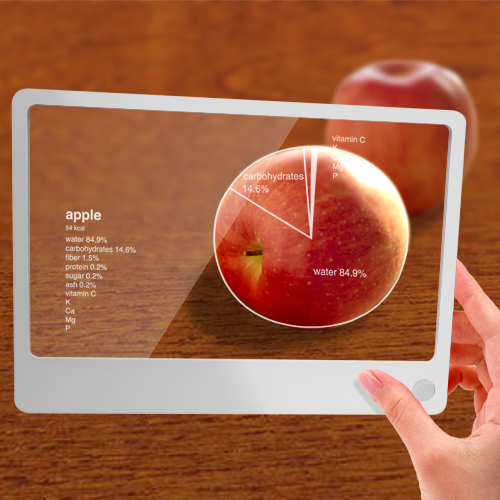
Mainly because I don’t usually care about nutrition when I eat, this kind of function would be helpful for people like me.

Also visit other posts of this gadget.


Part1:”Future of Internet Search: Mobile version”


Part2:”Future of Mobile Internet Search: Applications”

future search mobile #3-2
Part3:”Look at What You Don’t See Through Glass”

future mobile search
Part5:”Future of Mobile Search- Search Beyond Time”

future of mobile search6
Part6:”Future of Mobile Search- Power of Visualization”

future mobile search
Part7:”Future of Mobile Search: Virtual Shopping #1″

Speech balloons for hearing-impaired
Part8:”Speech Balloons for the Hearing-Impaired”


iPhone with Looking Glass
See also the iPhone version of this concept.

Creative Commons License

This work is licensed under a
Creative Commons Attribution 3.0 Unported License.

Look at What You Don’t See Through Glass

Here are some more examples of how you might be able to use the device I introduced before.
(“Future of Internet Search: Mobile version” and “Future of Mobile Internet Search: Applications“.)

future search mobile #3-1

future search mobile #3-2

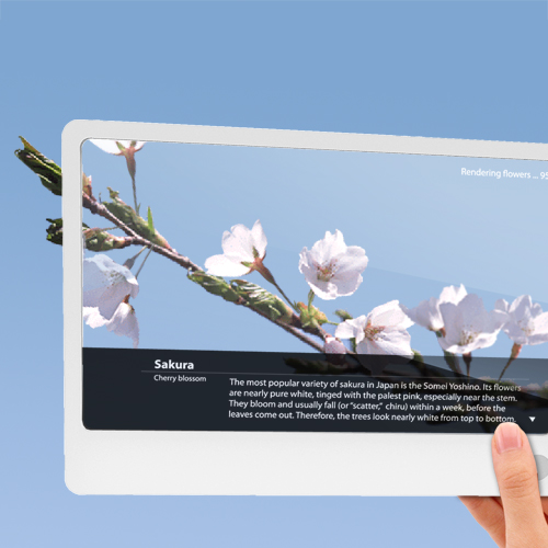
You can even see flowers that are not actually blooming.

There are a lot more ideas drawn in my Moleskine, so I’ll introduce them later.

Also visit other posts of this gadget.


Part1:”Future of Internet Search: Mobile version”


Part2:”Future of Mobile Internet Search: Applications”

future mobile search for diet
Part4:”Future of Mobile Search for Diet”

future mobile search
Part5:”Future of Mobile Search- Search Beyond Time”

future of mobile search6
Part6:”Future of Mobile Search- Power of Visualization”

future mobile search
Part7:”Future of Mobile Search: Virtual Shopping #1″

Speech balloons for hearing-impaired
Part8:”Speech Balloons for the Hearing-Impaired”


iPhone with Looking Glass
See also the iPhone version of this concept.

Creative Commons License

This work is licensed under a
Creative Commons Attribution 3.0 Unported License.

Future of Mobile Internet Search: Applications

I think the following ideas should enhance the functionality of the device I introduced. Many applications like these will be developed that have never been possible.

Applications

Indoor guide
Works in a building, airport, station, hospital, etc.

Applications

Automatic simultaneous translation

Applications

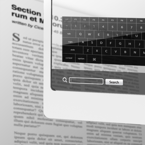
Search keyword
Helpful when you want to find out a word from a lot of text

Also visit other posts of this gadget.


Part1:”Future of Internet Search: Mobile version”

future search mobile #3-2
Part3:”Look at What You Don’t See Through Glass”

future mobile search for diet
Part4:”Future of Mobile Search for Diet”

future mobile search
Part5:”Future of Mobile Search- Search Beyond Time”

future of mobile search6
Part6:”Future of Mobile Search- Power of Visualization”

future mobile search
Part7:”Future of Mobile Search: Virtual Shopping #1″


iPhone with Looking Glass
See also the iPhone version of this concept.

Creative Commons License

This work is licensed under a
Creative Commons Attribution 3.0 Unported License.

Future of Internet Search: Mobile version

Mobile version

(Followed by a previous post “Future of Internet Search“)
This is what I wish the internet search will be able to do with a mobile device in the NEAR future. Touch screen, built in camera, scanner, WiFi, google map (hopefully google earth), google search, image search… all in one device. Like this way, when you can see a building through it, it gives you the image search result right on the spot.

Mobile version

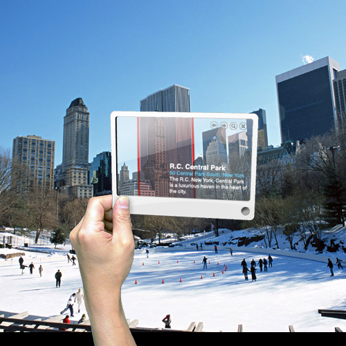
Choose a building and touch a floor and it tells you more details of the building.
Well, it doesn’t have to be a building, but it can be any object you see. You can use it when you want to know a car model, an insect name, what kind of food is served at a restaurant and how much, who built a bridge, etc. etc. But as a designer myself, I hope it’s able to tell me a name of a font of the type I see, the size, color (in RGB), and so on.

Mobile version

It’s got a scanner built in, so you can use it this way when you want to check the meaning of a word in the newspaper, book, magazine, etc.

Mobile version 

It would be much easier to read a real book. You can use the dictionary, wikipedia, thesaurus and anything else available on the web. What do you think?

red dot design concept award 2009 winner
I won the red dot design concept award for this.

Also visit the later series of this gadget.

Part2:”Future of Mobile Internet Search: Applications”

future search mobile #3-2
Part3:”Look at What You Don’t See Through Glass”

future mobile search for diet
Part4:”Future of Mobile Search for Diet”

future mobile search
Part5:”Future of Mobile Search- Search Beyond Time”

future of mobile search6
Part6:”Future of Mobile Search- Power of Visualization”

future mobile search
Part7:”Future of Mobile Search: Virtual Shopping #1″

Speech balloons for hearing-impaired
Part8:”Speech Balloons for the Hearing-Impaired”


iPhone with Looking Glass
See also the iPhone version of this concept.

Creative Commons License

This work is licensed under a
Creative Commons Attribution 3.0 Unported License.

Future of Internet Search

future search engine

This idea is mostly based on what I thought for a search engine portal’s design competition (not Google’s) held a few months ago in Japan, where mine was picked for the first round. I redesigned it a little bit after that (especially after getting amazed by the latest touch screen technology). By looking at the future user interface by Apple’s iPhone, Microsoft’s Surface, Multitouch and so on, it is quite obvious to predict what the future user interface will be like. These are good examples of making the user experiences “intuitive”. I won’t elaborate on it, but “being intuitive” is essential when it comes to developing a user-friendly website. Not only website but whole other stuff which requires a user’s control.

“Search” is to look for and find something. When we look for something, we usually picture the object’s color, shape, size, etc. first in our heads. Then you think of the place you saw the object last, go and look around there to find something similar to what is pictured. You use your nose to smell and hands to feel and get unwanted objects away. In this design, the search results, websites, contents, images and banners are all “objects”, which are identified as icons. You look for something just like you do in the physical world. It has a table like plate in the middle and there are icons on it. Through the real-world physical movements, intuitive controls of “search” is realized. In addition, an unreal but ultra-practical action is incorporated by taking advantage of technology.

In short, this search can do:
Put and remove stuff by drag & drop
Organize icons to categorize scattered icons
Quick preview just like you take and see stuff closely
Set stuff you need aside for laterPile up icons, etc.

homepage

Home page
This is what you see first when you log in. It’s as simple as Google top page.
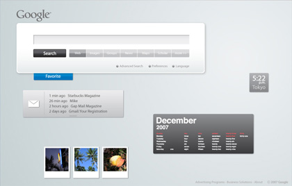
personalized home

Portal Home
For the personal portal site like iGoogle, you see ad banners and customized contents, tools, etc., but all of them are shown as icons. You can touch, move, pile and throw them just like books and paper. Your favorite items (clock, memo pad, calendar, RSS reader, weather news, etc.) can be added as you like. Simple mail app allows you to read and write mail quickly. The customized tabs on the left show the category you pick up, such as news, music, movies. By clicking one, the related icons rush into the screen.

searching animation

Search screen (Each icon is supposed to show the website’s image actually. Lazy me!)
Input the keyword and hit “Search”button, search results roll in the window until there are a certain number you first set. The keywords you used are displayed clearly in the screen. In most cases, a screen with lots of objects in it look busy and not aesthetically pleasing, but here I tried to make the search results themselves become a part of design. Each result icon is shaped according to what it is categorized: website, image, RSS, groups, ad banners, etc. The more the website is optimized for SEO, the more chance it has to appear upper and left side of the screen, thus stands out. If the number of the results hit the limit, the next group will be put in the area below the first one. You can see them by clicking the arrow, of course, but in the transition, the “camera” moves downwards.
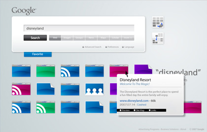
search results aligned

Search Results Aligned
After the results roll in the screen, the “Align/Categorize” buttons appear in the top right side. “Grid/Scatter”, “Category”. The Grid button makes all the icons align straight on the grid, while the Scatter button mess them up. When you click the Categorize button, icons of the same category flock together.

When the cursor is over an icon, the meta data is shown graphically, which allows you to predict the contents of the site quickly before actually visiting.

quick look at website

site map preview

You can also click the “Site Map” button to easily get the visual structure of the website. Also, “Links” button gives you the sites linked to it.

favorite box

Favorite Button By clicking the “Favorite” button (or dragging an icon towards the button), it opens and becomes ready to store icons. Here you can stock results you like for later review. Drop an icon there and it is automatically aligned and its simple introduction is shown. When there are multiple icons in it, they are categorized automatically.
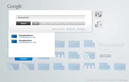
favorite box functions

I want to use a search like this, but I’m afraid the hardware won’t come up with the data processing… We have to wait for a while.

Ultra thin display

sheet searching words
Accustomed to Google search so much, I sometimes look for “a search button” even when I read a real newspaper looking for a specific word. So it would be nice if there is a device like this to quickly find and highlight the word you specify. It would be even better if it can tell you the meaning of a word you don’t know. It’s so light and thin that you wouldn’t mind carrying it around at all. Oh, if there is a keyboard that can attach the screen to it, it’d be really good if it works as a computer.

translucent display
Pubic billboards and spaces are so much filled with information that it takes you time to find what you really want. With this transparent sheet, only you can see the info you want on various places like walls, floors, ceilings, notice boards, etc. In a large building with many people coming for the first time, such as hospitals, this sheet could be handed to a visitor (especially a senior) as a guide. This way, what you see and how you see it can be customized.


Creative Commons License


This work is licensed under a
Creative Commons Attribution 3.0 Unported License.