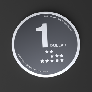
The round shaped coins must have a lot of benefits that other figures such as a triangle or a square don’t. Also, non-rounded coins may have many demerits. Aside from those, travelers and other people who are not accustomed to the currency would be able to easily remember how much each of these coins is (as long as she knows how to read pie charts).
This work is licensed under a
Creative Commons Attribution 3.0 Unported License.


Interesting idea. But they stopped doing those crazy square corners centuries ago because making the coins round is better for your hands and your pockets
Cool concept man, things like coins are some of the longest standing traditions we never bother to rethink, I suppose wireless payment will probably superseed them too!
I love the idea.. but.. needs refinement. like…
Why wouldn’t 25¢ just be a 1/4 hole in the dollar coin? and 50¢ a 1/2 hole? stuff like that.
But i like where this is going.
Coin-ops need round coins. There’s a huge demand for coin-operated machines, from tickets, to vending, to parking and so on.
The half and quarter sizes may go through, but so would a lot of other crap. Vending machines already have to reject washers, bottle caps and blanks – all of them being rounded objects. If they accepted a half coin, then which half would go through? The round half – like a full coin – or the flat half – like a long thin coin? So the machine would have to be able to reject a whole new range of slugs. Bent bottle caps, for example.
Sorry – back to the drawing board with this one.
What an incredible waste of time…
… Says someone leaving a worthless post on a blog.
Disagreeing with the outcome of a design exercise doesn’t make it a waste of time.
Parabens pela ideia! Simplesmente fantastico!
é bom para a comunidade pelo seu design, trás vantagens aos invsuais, que conseguem facilmente identificar as moedas, e até mesmo as pessoas mais idosas que não conseguem identificar as moedas. Um projecto que deveriam sem duvida seguir em frente.
Muitos parabéns pela ideia! Genial!.
Candeias,
Portugal
Obrigado!
cool idea btw:D
I don’t quite get the concept. Do you propose that each country is redesigning their coins to represent their value in comparison to the US dollar? Or are these coins just reminders to the traveller?
If the formed is the case, then a) I’m not sure that everybody wants to redesign a significant element of their national identity to cater for American tourists having difficulty to calculate the price of their souvenirs and b) these coins would have to be revisited every time the exchange rates changes.
이거 좋네요^^ 이해하기도 쉬울것같고
Interesting idea, love the execution of design, not so sure about the segmented coins though. Surly better just to use relative sizes.
this is pure genius. i love the ideas, and how much more usable the coins are, for blind or elder persons.
wonderful!
Thank you so much, diginoodles!
Mac, this is brilliant, more of this and less of those scifi concepts please 😉
that is a really great design
I love the design – I find them quite inspiring. The comments that coins need to be round(-ish) however, do have merit.
How about the current design of the coin, plus a collar so that the design is something like a bimetal coin with centre part with the missing portions? The quarter could then sit in a circular collar with a three-quarter hole around it. The outer collar could then bear the denomination, country of origin and any blurb which the issuer wants to put on it.
great money diseng
jeah its a very good site but i wanna now
wath about the Jen
Where can I get a set of these. I really would like to add a set to my coin collection.
man you should join DeviantART!
A great/refreshing/innovative concept.
Practical? Not so sure, but hey, this is how all great design ideas start?
remember people, I don’t think this was made to change the game! Just a nice idea.
I think coins will be finished soon anyway. I personally hope so and can’t wait for the day when we just have a card with everything on it and no tangible money is used. Lets hope I am still alive 🙂
This seems like a good idea…and useful for blind people (like someone else commented above) http://www.skycoequipment.com
What the heck, what a coin sample you have there. Nice work.
Very cool!
very creative. Cool!
This could pontenetially save nations billions of dollars by reusing some of their materials plus it look so cool 😛
I think its a good idea, but it’d be a loong time before people would be willing to accept these coins world wide. Plus the design for the 25 cent and the 50 cent are a little strange and seem like they would be a pain to deal with.
As it stands, it may be a good concept to make up with a additional entry to update everyone. A lot of people need to see this and shall go for it.